
Website Conversion Strategy: Why Beautiful Websites Fail
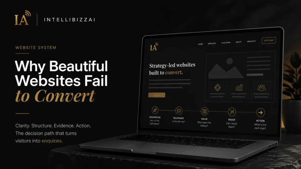
Website Conversion Strategy: Why Beautiful Websites Fail to Convert
Why a beautiful website can still generate no enquiries, and how Decision Architecture (orientation, relevance, value, evidence and action) turns a first impression into a meaningful next step.
A website can look expensive and still perform badly. The typography may be elegant. The animations may be smooth. The photographs may be professionally produced. Every section may appear carefully designed. Yet visitors leave without making contact.
This is usually described as a conversion problem. It is more accurately a decision problem. People do not act because a website is beautiful. They act when the website gives them enough clarity and confidence to make the next decision.
That process has an architecture.
Decision Architecture is the deliberate sequence of information, proof and interaction that moves a visitor from a first impression to meaningful action. It is the underlying structure that determines whether a beautiful website converts or simply impresses. A conversion-focused website is not a collection of attractive sections. It is a guided decision system.
Key Takeaways – A website that fails to convert is usually a decision problem, not a design problem. Visitors leave when they cannot resolve the uncertainty in front of them. – Conversion is a sequence of small decisions, ordered as orientation → relevance → value → evidence → action. – Features explain the components; value explains the change they create. Most pages list the first and forget the second. – Proof must arrive before the final decision. The goal is to shorten the distance between a promise and its evidence. – A strong call to action is not a command; it is the logical continuation of the argument the page has already made.
The real job of a business website
Many websites are built as digital brochures. They introduce the company, list the services, show a few images and provide a contact form. That may be enough to establish that the business exists. It is not always enough to make the business easy to choose.
A serious website must perform several jobs at once:
- explain what the company does;
- show who the service is for;
- communicate why the offer matters;
- reduce uncertainty;
- establish credibility;
- distinguish the company from alternatives;
- and make the next step feel clear and proportionate.
When one of these jobs is missing, the visitor must complete the reasoning alone. Most will not. They may not actively reject the company. They simply postpone the decision, continue comparing or close the page.
This is why website conversion strategy begins before the call-to-action button. It begins with the first question in the visitor’s mind: Am I in the right place?
Conversion is a sequence of small decisions
A visitor rarely arrives ready to complete the final action immediately. Even someone with strong buying intent must resolve a series of smaller questions first:
- What is this?
- Is it relevant to me?
- Does this company understand my problem?
- Is the solution credible?
- Is it different from the alternatives?
- What exactly will I receive?
- What will this require from me?
- Can I trust the people behind it?
- What happens after I click?
- Is this the right moment to act?
Each unanswered question creates friction. The website does not need to eliminate every possible objection. It needs to address the most important uncertainties in the correct order. That order is Decision Architecture.

The five layers of Decision Architecture
Each layer answers one question the visitor is already asking. When they are arranged in the right order, the next step feels natural.
1. Orientation
Before persuasion comes orientation. The visitor must understand where they are and what the company offers. This sounds obvious, yet many homepage headlines avoid direct explanation. They use language such as:
- Ideas without limits.
- Designed for what comes next.
- Building tomorrow together.
- Where vision becomes reality.
These statements are broad enough to apply to almost any company. They may sound confident, but they do not reduce uncertainty. A strong opening should create immediate orientation by communicating some combination of the category of service, the intended client, the problem being solved, and the outcome being created.
For example: Brand, website and visibility systems for founders who need to look credible and convert online. The sentence is not trying to describe every deliverable. It is giving the visitor a useful mental model.
The ten-second orientation test: show the homepage to someone unfamiliar with the company for ten seconds, then ask what the company provides, who it is for, and what result it promises. When the answers are vague, the website has an orientation problem. Adding more sections will not solve it. The opening message must become clearer.
2. Relevance
Understanding the service is not the same as feeling that it is relevant. A visitor may recognise that a company builds websites and still wonder: Is this designed for a company of my size? Does this team work with businesses like mine? Will they understand a premium service brand? Is the offer intended for startups, creators or large corporations? Is this a template service or a tailored engagement?
Relevance is created through specificity. This includes naming the intended customer, describing the problems they recognise, showing scenarios that reflect their situation, using examples from related categories, and clearly defining who the service is not designed for. A website that tries to appeal to everyone often feels personally relevant to no one.
Specificity does not always reduce opportunity. Business owners sometimes resist clear positioning because they fear excluding potential clients. The opposite problem is usually more damaging. When the language is too broad, the visitor cannot determine whether the company has meaningful expertise in their situation. A defined audience does not mean rejecting every other enquiry. It means giving the right enquiry a stronger reason to continue.
3. Value
Once the visitor understands the offer and sees its relevance, the website must explain why the service matters. This is where many companies replace value with features. They describe the number of pages, the software being used, the file formats, the tools included, or the number of revisions. These details are useful later. They are not the primary reason someone buys.
A founder does not usually want five website pages because five pages are inherently desirable. They may want a more credible first impression, fewer repetitive sales conversations, a clearer explanation of their services, better-qualified enquiries, greater confidence when sending people to the website, or a digital presence that reflects the real quality of the business.
Features explain the components. Value explains the change those components create.
Translate the deliverable into a business outcome. Instead of writing “Responsive five-page website,” write “A clear, responsive website that explains your offer, builds trust and gives qualified prospects a direct path to contact you.” Instead of “Messaging document included,” write “A practical messaging system that keeps the homepage, service pages and future content aligned around the same positioning.” The best website copy connects the tangible deliverable with the reason it matters.
4. Evidence
A company can describe itself as strategic, premium, experienced or results-driven. Those words carry little weight without evidence. Proof reduces the risk of believing the claim.
It can take several forms: case studies, named client work, before-and-after comparisons, client testimonials, screenshots, documented processes, project results, founder experience, certifications, detailed explanations, and examples of thinking. Not every business has a large portfolio. That does not mean it has no proof. A new company can demonstrate competence through a transparent methodology, detailed sample work, original analysis, strong personal experience, documented decisions, and a clear standard of delivery. The goal is to shorten the distance between the promise and the evidence.
Why generic testimonials are weak. “Amazing service. Highly recommended.” is positive but not very informative. A stronger testimonial explains what the client needed, what changed, what the process felt like, and why the outcome mattered. For example: “Before the project, we struggled to explain the difference between our services. The new positioning and website made the offer much clearer, and our sales conversations became significantly more focused.” The second testimonial helps the visitor imagine a relevant result.
Proof should match the claim. When the website claims strategic depth, proof should show strategic thinking. When it claims premium design, proof should show polished design. When it claims conversion expertise, proof should explain how conversion decisions were made. Random logos are not always enough. The proof must support the specific reason someone is being asked to trust the company.
This is also how Google’s people-first guidance thinks about content. Useful, evidence-backed, reader-first material is what search systems are designed to reward (Google, “Creating helpful, people-first content”). A credible page answers the reader’s questions with substance, not decoration.
5. Action
When conversion is weak, attention often turns to visual elements: the button colour, the font size, the number of form fields, the placement of the CTA, or the speed of an animation. These can matter. But some of the most damaging friction is conceptual.
Conceptual friction appears when the visitor cannot answer questions such as: What exactly is included? How much might this cost? How long does it take? What information do I need to provide? Will I own the final work? Is this a one-off service or a subscription? What happens after I submit the form? Do I need to attend several calls? Is the service suitable for my current stage? A visually simple contact form can still feel difficult when the process behind it is unclear.
The problem with premature calls to action. A homepage may ask the visitor to Book a strategy call. But the visitor may not yet know what will be discussed, whether the service is affordable, whether the company is suitable, or what happens after the call. The CTA is asking for commitment before creating enough confidence. A better conversion path may include lower-friction actions such as exploring the service, viewing the packages, seeing the process, reading a relevant case study, requesting a quote, or checking whether the service is a good fit. Not every visitor needs the same next step. A strong website supports different levels of readiness without becoming confusing.
Momentum: making the next step feel natural. A good call to action is not a command added at the end of a page. It is the logical continuation of the argument the page has made. When the page has established what the service is, who it is for, why it matters, how it works, what it includes, and why the company is credible, the next action feels proportionate. This is momentum. The visitor does not feel pushed. They feel ready.
Strong calls to action are specific. Compare Get started. with Request your website proposal. Or Let’s talk. with Tell us what your current website needs to change. The more specific CTA reduces uncertainty about the action. It tells the visitor what they are doing and what kind of response to expect.
The page after the click also matters. Conversion continuity should continue after the CTA. A quote form, booking page or contact page should confirm what information is needed, why it is being requested, how long the process takes, what happens after submission, and when the visitor can expect a response. A polished homepage followed by a confusing form creates a break at the most important moment.
The homepage is not the entire website
Businesses often place too much pressure on the homepage. They try to include every service, argument, case study, feature, testimonial and objection on one page. This creates density without necessarily creating clarity.
The homepage should establish the core decision path. Supporting pages should provide the depth required for specific decisions. A strong website architecture may include:
- Homepage: provides orientation, relevance, high-level value, primary proof and clear next steps.
- Service pages: explain individual offers, outcomes, deliverables, process, pricing logic and suitability.
- About page: shows the people, experience, principles and perspective behind the work.
- Case studies: demonstrate how thinking became implementation and what changed as a result.
- Process page: reduces uncertainty about collaboration, timelines, responsibilities and stages.
- Pricing or packages: helps the visitor determine whether the service matches their budget and level of need.
- Journal or insights: demonstrates expertise, answers customer questions and creates additional discovery paths.
Each page should have a distinct decision purpose. When several pages repeat the same vague introduction, the architecture is not doing enough work.
Seven reasons a polished website may not convert
- The opening is visually strong but verbally unclear. The visitor notices the design but cannot describe the offer.
- The website describes the company rather than the customer’s decision. The content focuses on mission, passion and capabilities without addressing the visitor’s situation.
- Services are listed but not explained. The visitor sees branding, websites and content but cannot understand what each service includes or when it is needed.
- The company claims quality without showing evidence. The website uses premium language but provides no relevant work, process or proof.
- Important questions are hidden. Pricing, timelines, deliverables and the working process remain unclear until a call.
- Every page uses the same call to action. Visitors at different levels of awareness are all pushed toward the same commitment.
- The visual identity and the offer feel disconnected. The website appears premium while the copy feels generic, or the offer sounds strategic while the design feels unfinished.
Conversion depends on coherence. Every part of the experience must support the same level of promise.
A practical website conversion audit
Review the website in the order a new visitor would experience it.
First screen. Can the visitor understand the service without scrolling? Is the intended audience visible? Is the result more prominent than the tools? Is there one obvious next step?
Main body. Does the website explain the customer’s problem accurately? Are the services connected to outcomes? Does each section answer a new question? Is there unnecessary repetition?
Proof. Are claims supported? Can visitors see relevant work? Does the proof reflect the service being promoted? Is the founder or team visible?
Offer. Are the deliverables clear? Is the process understandable? Are timelines explained? Is there enough pricing context to support qualification?
Calls to action. Does each CTA describe the next action? Is the level of commitment appropriate to the page? Does the destination continue the same message?
Mobile experience. Does the message remain clear on a smaller screen? Are the buttons easy to use? Do visual effects slow down access to the important information? Is the content still presented in a logical order?
A conversion audit should not begin by asking what colour the button should be. It should begin by identifying where the visitor’s reasoning becomes uncertain.
Design should strengthen the decision
Visual design matters. It influences perception before the visitor reads a complete sentence. Spacing, typography, imagery, colour and motion can make a company appear established or improvised, premium or generic, focused or chaotic, human or distant, modern or outdated.
The mistake is treating design as decoration. Strategic design gives information hierarchy. It tells the visitor what matters first, which sections belong together, where to pause, where evidence appears, and what action is available.
A beautiful website can fail when the design competes with the decision path. A restrained website can perform well when every visual choice supports clarity and confidence. The goal is not minimalism for its own sake. The goal is precision.
Toward a clearer commercial experience
A website should not be designed independently from the brand and offer it represents. The strongest website projects begin by clarifying positioning, audience, service structure, value proposition, messaging, proof, and the desired conversion path. Only then should those decisions become pages, sections and interface components.
This is the same thinking behind the Discovery Stack framework, which treats visibility and conversion as connected systems: brand creates recognition, message creates understanding, structure creates confidence, proof reduces risk, and interface makes action easier. The objective is not simply to create a better-looking website. It is to create a clearer commercial experience.
A website should make the decision easier
The purpose of a business website is not to impress every visitor. It is to help the right visitor make a better decision. That requires more than visual polish. It requires a deliberate sequence of orientation, relevance, value, evidence and action.
When that sequence is clear, the website feels simple even when the service is complex. When it is missing, even a beautiful website can feel difficult. The most effective websites do not pressure people into converting. They remove the uncertainty preventing the right people from moving forward.
That is the foundation of website conversion strategy. Not more persuasion. Better decisions.
Frequently Asked Questions
What is a website conversion strategy? A website conversion strategy is the planned structure used to move visitors toward a meaningful action, such as requesting a quote, booking a consultation or purchasing a service. It includes messaging, page architecture, proof, user experience and calls to action.
Why is my website receiving traffic but no enquiries? Traffic may fail to generate enquiries when visitors do not understand the offer, do not see its relevance, cannot find enough proof or feel uncertain about the next step. The issue is often a break in the decision path rather than a lack of traffic.
Does good website design improve conversions? Good design can improve conversions when it strengthens clarity, trust and usability. Visual quality alone is not enough. The design must support the message, guide attention and make important information easy to understand.
What should a high-converting service website include? A high-converting service website should include a clear value proposition, defined audience, detailed services, meaningful proof, a transparent process, relevant FAQs and calls to action matched to the visitor’s level of readiness.
Should service businesses show prices on their websites? Not every service requires fixed public pricing, but visitors should receive enough context to understand the likely investment. Starting prices, package ranges or an explanation of how pricing is determined can improve qualification and reduce unnecessary friction.
Ready to build your brand system?
Whether you need an Identity System, a premium website, or a full visibility strategy — we build systems that make people recognize, remember, and choose your brand.
Get a Custom Proposal (48H)Or start with a Brand Vibe Report™ — see your brand through AI eyes first.